Looking back at Part 1 of this series, we discussed the basics of creating a “Lookless” control and how the UI interacts with the EditableCustomControl. We discussed creating controls using Dependency Properties and how to customize the class and make it work in the UI. Here we will build a more complex UI template and look at why a developer would want to start creating “Lookless” controls.
Why Lookless controls?
As previously explained, the reason for creating “Lookless” controls, is to have as little functionality in the main view/window as possible. Reusability is also important; to not use the same amount of code to create the same control in each view/window. This provides a fast development process, less functionality issues, and a simple “one change fix for all views” situation.
Control Template
Let’s look at creating the Control Template that consists of a TextBlock, ComboBox, Edit Button, and New Button. For this example, I will explain how and why we will create a control template using these specific controls inside the template. Keep in mind that this can be done with any part of your code that you would like to simplify and reuse.
The reason for creating a Control Template is so that we can use this template throughout our development process, as we would need to have a selected source for our tools before a user can continue.
Window/View
Looking at the Control Template, we can see what goes into creating a selection option. Normally you would not have to be concerned about going through this process, if you only had to use this in maybe two different scenarios. Now, think about creating this process another 15 or 20 times over, in each view that requires it. This might not seem like something that could benefit everyone, but that’s for each developer/team to discuss and see where they could end up spending less time on writing code. What we end up using in the UI is one line of code that binds to the control template.
<ControlTemplate x:Key="SelectionGrid">
 <Grid x:Name="SourcesGrid" >
  <Grid.ColumnDefinitions>
   <ColumnDefinition Width="Auto"/>
   <ColumnDefinition Width="*"/>
   <ColumnDefinition Width="Auto"/>
   <ColumnDefinition Width="Auto"/>
  </Grid.ColumnDefinitions>
  <TextBlock x:Name="SourceLabel" Text="Source" Margin="0,0,3,0" />
  <ComboBox x:Name="SourcesComboBox"
    Grid.Column="1"
    DisplayMemberPath="Name"
    Margin="0,0,3,0"
    ToolTip="Select from the source list"
    ItemsSource="{Binding Sources}"
    SelectedItem="{Binding SelectedSource , Mode=TwoWay}">
  </ComboBox>
  <Button x:Name="SourceEditButton"
    Grid.Column="2"
    Margin="0,0,3,0"
    Content="Edit"
    ToolTip="Edit Selected Source"
    Command="{Binding EditSourceCommand, Mode=TwoWay}">
  </Button>
  <Button x:Name="SourceNewButton"
    Grid.Column="3"
    Content="New"
    Width="Auto"
    ToolTip="Create New Source"
    Command="{Binding NewSourceCommand, Mode=TwoWay}">
  </Button>
  </Grid>
</ControlTemplate>
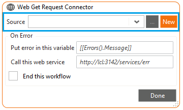
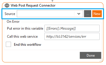
Result
Below are a few examples of the tools we are creating for Warewolf, using this approach you can easily see the benefit. This approach saves us from rewriting the same code, creating the same type of UI, and allows us to use the same approach anywhere possible.
Conclusion
There is really a lot of options to consider when creating “Lookless”, so it us up to us as developers to experiment on our code and find ways to reuse or simplify the structure of it. We are all trying to find better and faster solutions. Come see what we are working on here and if it will work for you.


Leave A Comment?